Enhancing Mobile Code Reviews: The Call for Mermaid Diagram Rendering on GitHub
In today's fast-paced development environment, efficiency and seamless workflows are paramount. As developers increasingly rely on mobile devices for quick checks and reviews, the tools we use must keep pace. A recent GitHub Community discussion brought to light a significant hurdle for mobile productivity: the inability of GitHub Mobile to render Mermaid diagrams within Markdown blocks.
The Challenge: Visuals Lost in Translation
The discussion, initiated by user remiville, highlighted a clear disparity between GitHub's desktop and mobile experiences. While github.com excels at rendering Mermaid diagrams in various contexts—from pull request descriptions and comments to issues and standalone Markdown files—GitHub Mobile currently displays these crucial visual aids as raw source code.
Consider a typical scenario in a pull request (PR) description or a review comment:
mermaid
graph TD;
    A[Start] --> B{Decision};
    B --> C[Process 1];
    B --> D[Process 2];
    C --> E[End];
    D --> E;
On a desktop, this block transforms into an intuitive flowchart, instantly conveying complex logic. On GitHub Mobile, however, it remains a block of text, forcing the reviewer to mentally parse the diagram or, more likely, switch to a desktop device.
Impact on Developer Performance KPIs
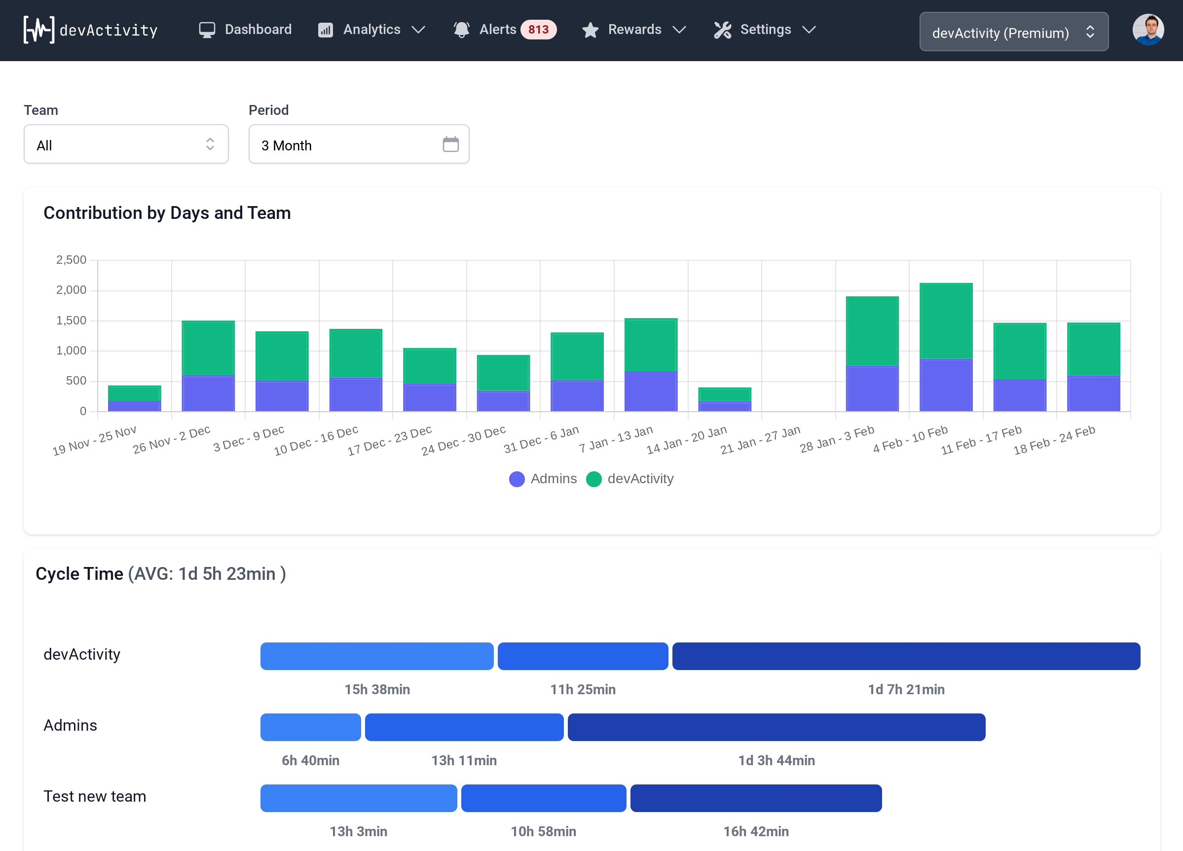
This seemingly minor rendering issue has a direct and measurable impact on developer productivity and can influence critical performance KPIs. Pull requests, especially those involving intricate architectural changes or complex logic, frequently leverage Mermaid diagrams to clarify concepts, illustrate data flows, or outline sequence interactions. When these visual cues are absent on mobile, reviewers face several challenges:
- Context Switching: Developers are forced to abandon their mobile review, find a desktop, and re-engage with the PR. This breaks concentration and adds unnecessary time to the review cycle.
- Reduced Efficiency: Without the immediate visual context, understanding the proposed changes becomes more arduous, potentially leading to slower review times and delayed merges. This directly impacts performance KPIs related to code velocity and time-to-production.
- Compromised Review Quality: A reviewer might miss subtle details or misunderstand the proposed design if they cannot easily visualize the diagram, leading to less thorough feedback.
The original post specifically called out PR descriptions and review comments as areas where the lack of rendering is most detrimental, emphasizing that the diagram is an integral part of the review process.
A Clear Path Forward
The proposed solution is straightforward: implement Mermaid diagram rendering within the mobile Markdown view, mirroring the desktop experience. As a first step, the discussion suggested a "View diagram" link that would open the rendered visual, offering immediate relief while a full rendering solution is developed. This would significantly improve the efficiency and performance of mobile code reviews.
While the original discussion was unfortunately closed by a GitHub Actions bot for not adhering to a specific submission format, the underlying need remains pressing. It underscores a community desire for GitHub Mobile to evolve into a truly comprehensive tool for developers, capable of handling all aspects of the development workflow, including rich visual documentation.
Conclusion
The call for Mermaid diagram rendering on GitHub Mobile is more than just a feature request; it's a plea for enhanced developer productivity and a smoother review process. Addressing this gap would not only streamline mobile workflows but also positively impact key performance KPIs for development teams, ensuring that critical visual information is accessible wherever and whenever developers need it. As development increasingly goes mobile, empowering reviewers with full context on their devices is crucial for maintaining high standards of code quality and team efficiency.