Daily Contributions Over a Year: Visualize Developer Activity
The Daily Contributions Over a Year feature on devActivity.com offers a powerful visual representation of developer and team activity. Mimicking a familiar GitHub-style contribution graph, this tool provides a comprehensive overview of daily activity across a 12-month period, extending up to the current date.
Users can easily visualize their contribution patterns, identify periods of high or low activity, and track progress over time. Team leads and managers gain invaluable insights into team dynamics, enabling them to forecast activity and leverage AI-driven insights to interpret trends and inform decisions, all without requiring deep manual analysis.
What is Daily Contributions Over a Year?
Found within the 'Analytics > Contributions' section, this feature presents a comprehensive visual overview of a user's or team's daily activity across a 12-month period. The widget mimics a standard GitHub-style contribution calendar, with months clearly labeled horizontally (e.g., Apr, May, Jun, Jul, Aug, Sep, Oct, Nov, Dec, Jan, Feb, Mar) and days of the week indicated vertically (e.g., Tue, Thu, Sat).
Each individual square within this grid represents a specific day. The intensity of the green color filling each square directly corresponds to the volume of contributions made on that day: darker green hues signify a higher number of contributions, while lighter green shades indicate fewer, and gray squares denote an absence of contributions. Users can interact with the widget by hovering their mouse over any given day's square, which triggers a tooltip displaying precise details, including the date and the exact contribution count (e.g., "Feb 14, 2026: 17 XP").
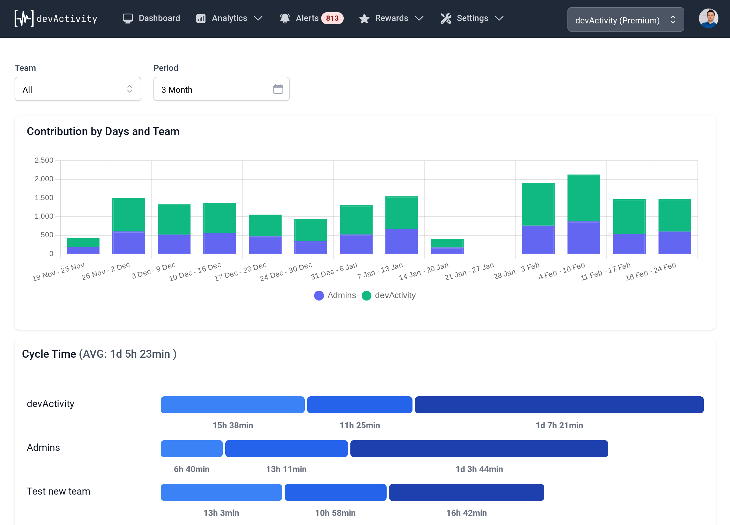
The system allows for focused analysis through filtering capabilities, enabling users to view contribution data specifically for a chosen team or an individual contributor. This flexibility helps in dissecting activity patterns and understanding dynamics across different organizational units or individuals.
Functionality extends beyond mere visualization, offering practical tools. A download icon facilitates the export of contribution data, typically in a CSV format, for further external analysis or record-keeping. Furthermore, for users with a premium subscription, a distinct sparkle icon grants access to an "AI insights" feature. This advanced capability provides pre-analyzed suggestions and actionable insights, specifically tailored to assist managers in understanding complex contribution dynamics and making informed decisions without the need for extensive manual data interpretation.
Who Benefits from Daily Contributions?
- Developers: Review personal contribution history, identify trends, and track progress over time.
- Team Leads: Analyze team-wide activity patterns, understand productivity cycles, and identify periods of high or low activity.
- Engineering Managers: Gain quick, automated insights into contribution dynamics for managerial planning, forecast activity, and inform strategic decisions leveraging AI-driven insights.
Key Features & Benefits
- Visual Calendar: A familiar GitHub-style grid for easy pattern recognition.
- Color-Coded Activity: Quickly identify high and low contribution days.
- Detailed Hover Tooltips: Get exact contribution counts for any specific day.
- Filtering Options: Analyze contributions by specific teams or individual contributors.
- Data Export: Download contribution data in CSV format for external reporting.
- AI-Powered Insights (Premium): Receive automated analysis and suggestions to understand complex dynamics.
Frequently Asked Questions
How many contributions did I/my team make on a specific day?
Hover over any square on the calendar grid to see the exact date and contribution count (e.g., "Feb 14, 2026: 17 XP").
What are the overall contribution trends over the past year?
The color intensity of the squares visually represents contribution volume. Darker greens indicate higher activity, allowing you to quickly identify periods of high or low engagement and overall trends.
Can I export my contribution data?
Yes, you can export your contribution data, typically in CSV format, by clicking the download icon within the widget.
What are the underlying reasons for specific contribution dynamics (with AI insights)?
For Premium users, clicking the sparkle icon provides AI-generated insights and suggestions that help interpret contribution dynamics and inform managerial decisions.
How do contributions vary by team or individual?
You can apply filters to view contributions specifically for a chosen team or an individual contributor, allowing for detailed analysis of activity patterns across different units.